Kathy
in Memos & Musings · 3 min read
Today we will be sharing with you one simple way to identify how a good performing stock looks without first having to look at the numbers. You do not have to be reading stacks of research reports or rely on hearsay which most of the time are not exactly helpful.
You simply take a look at its price chart over a 5 year period using the daily candles. You can head over to stocks charting platforms or even web-based one like Yahoo Finance.
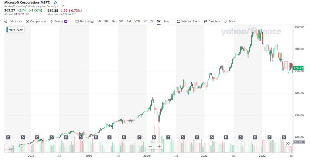
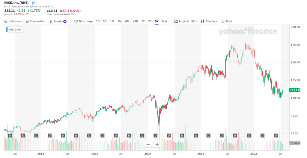
A good performing stock will consistently break new highs over time. You will see that it makes higher highs and higher lows. Yes you heard that right. Higher lows as well. No stocks move in a linear fashion without retracements. If it does, you better examine closely why it is so and make sure that it is not a pump and dump scheme. (Note that we are looking for a general uptrend over a longer period of time. In the short term, good stocks will have their own bear markets as well.)
You can take a look at the charts of companies like Microsoft, Google and Nike. Do you see the same patterns of higher highs and higher lows?


That said, this should ONLY be used as the first criteria when screening a good performing stock. Do not use this method solely to make your buying decisions. But you can use this method to filter away many stocks in your consideration list immediately.
Personally, I have been using this method since I started investing and this little screen time helps me to immediately filter away companies that are not worth my time to dig deeper. In all likelihood you will find that the majority of the companies will not even pass this initial screening.
Think logically, if a company does not continue to make new highs over the past 5 years, what makes you think it is going to do so in the upcoming ones? While past performance is not indicative of future performance, I would like that a company has a good track record of doing what I would want to see them do first. The charts never lie. Success always leaves clues that an investor can pick up from easily.


About Kathy
Co-Founder of The Joyful Investors and Co-CIO of InvestingNote Portfolio. I graduated with a degree in Economics in National University of Singapore (NUS). My previous experience with traders at the Merrill Lynch enable me to realize many counter-intuitive truths about how the financial markets work and to uncover the challenges faced by many new investors. Investing can be astoundingly simple, and my goal is to make financial education accessible and easy to understand for everyone.
Important Information
This document is for information only and does not constitute an offer or solicitation nor be construed as a recommendation to buy or sell any of the investments mentioned. Neither The Joyful Investors Pte. Ltd. (“The Joyful Investors”) nor any of its officers or employees accepts any liability whatsoever for any loss arising from any use of this publication or its contents. The views expressed are solely the opinions of the author as of the date of this document and are subject to change based on market and other conditions.
The information provided regarding any individual securities is not intended to be used to form any basis upon which an investment decision is to be made. The information contained in this document, including any data, projections and underlying assumptions are based upon certain assumptions and analysis of information available as at the date of this document and reflects prevailing conditions, all of which are accordingly subject to change at any time without notice and The Joyful Investors is under no obligation to notify you of any of these changes.
· · ·
Have you enjoyed this article? We’d be grateful if you would share this useful content to your friends who may benefit from it as well.


